IRCTC APP Redesign
Redefining Convenience: From Confusion to Clarity
Problem
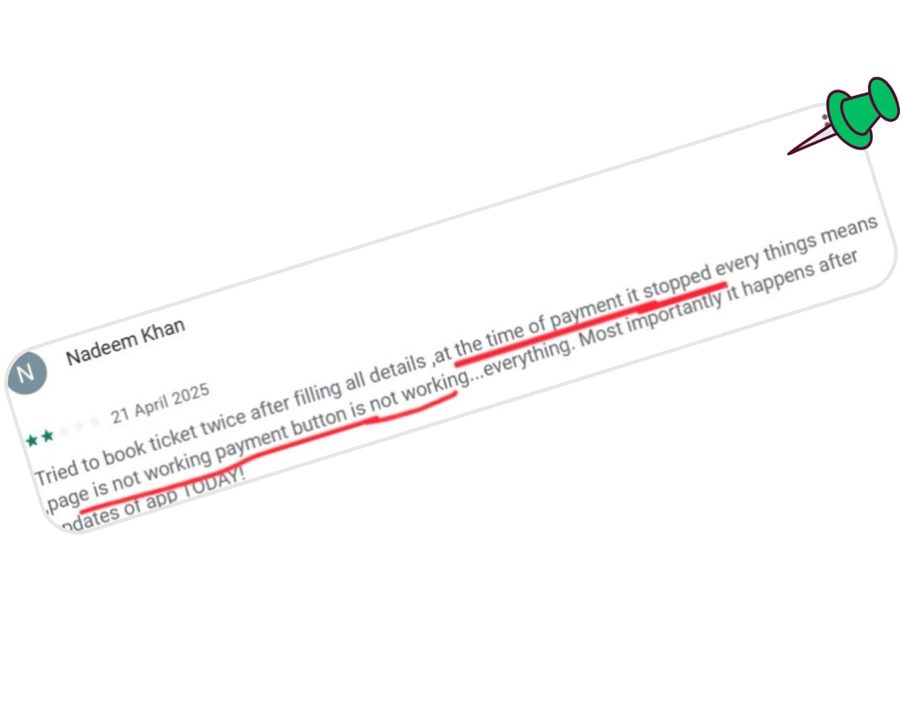
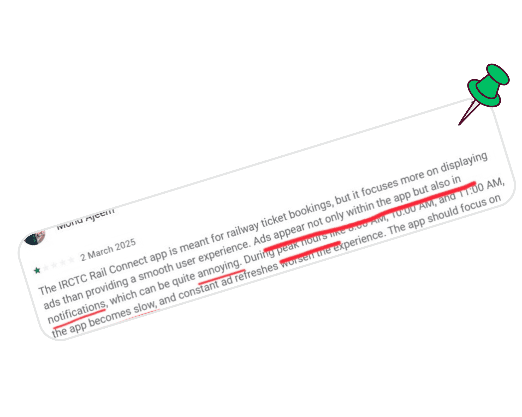
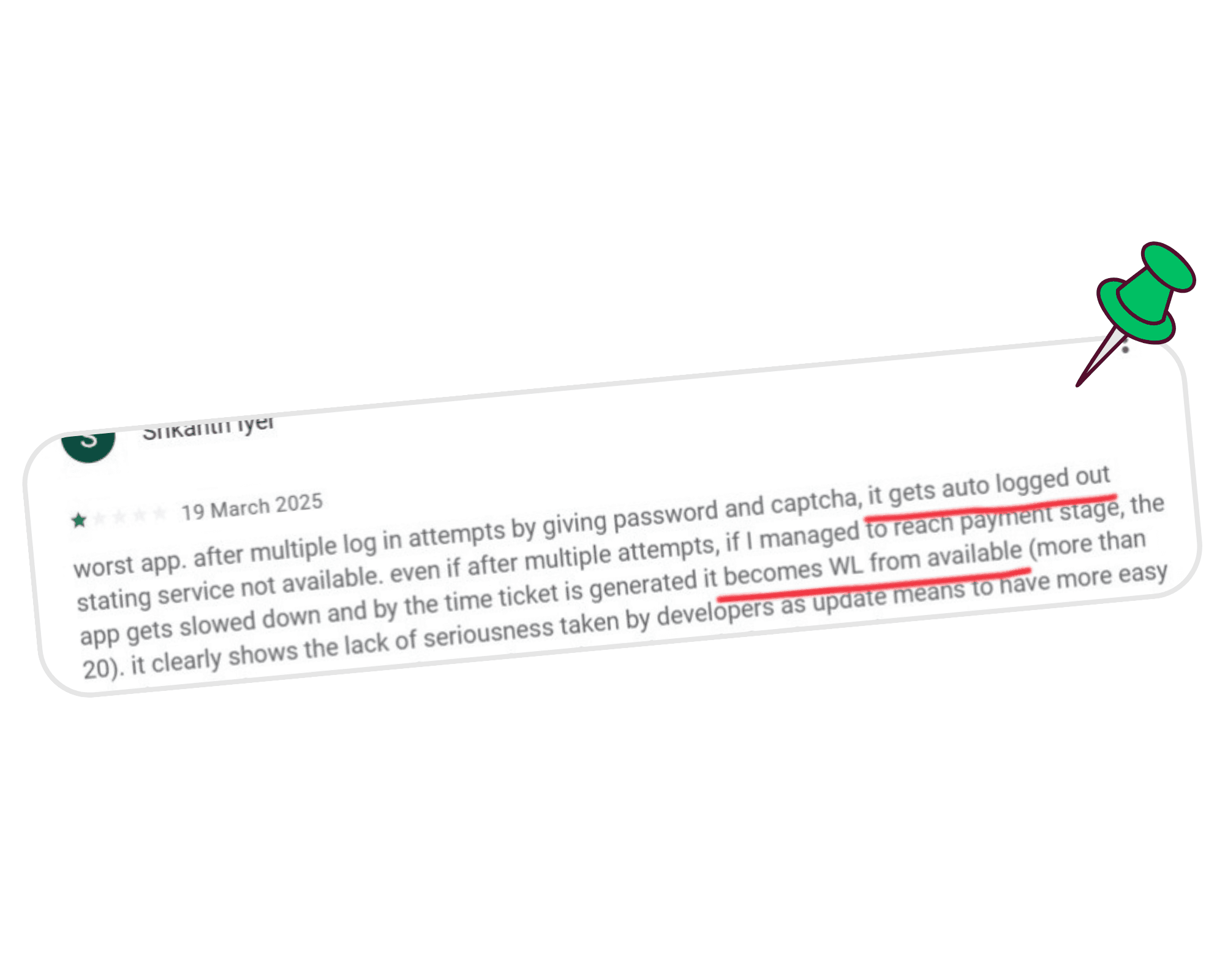
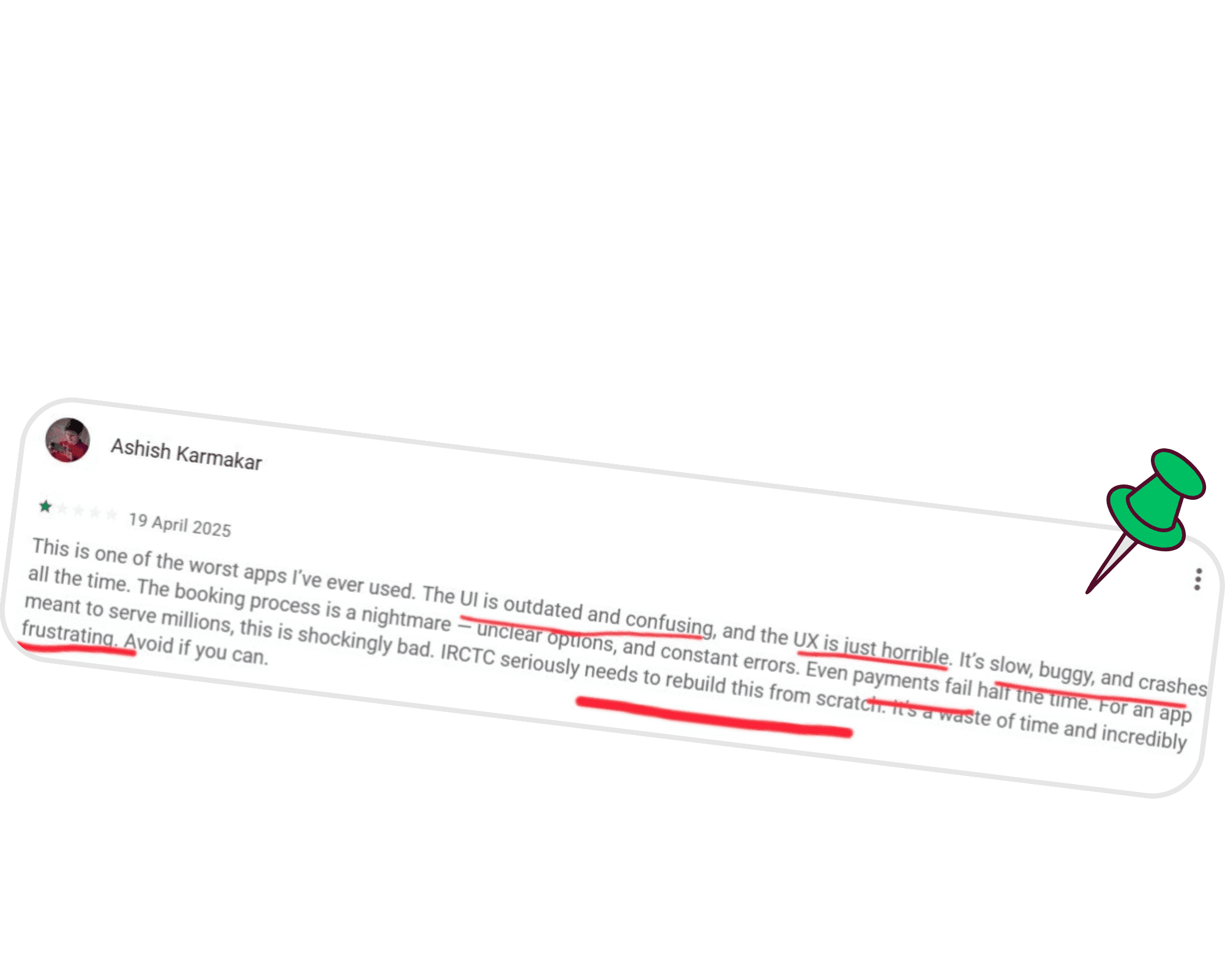
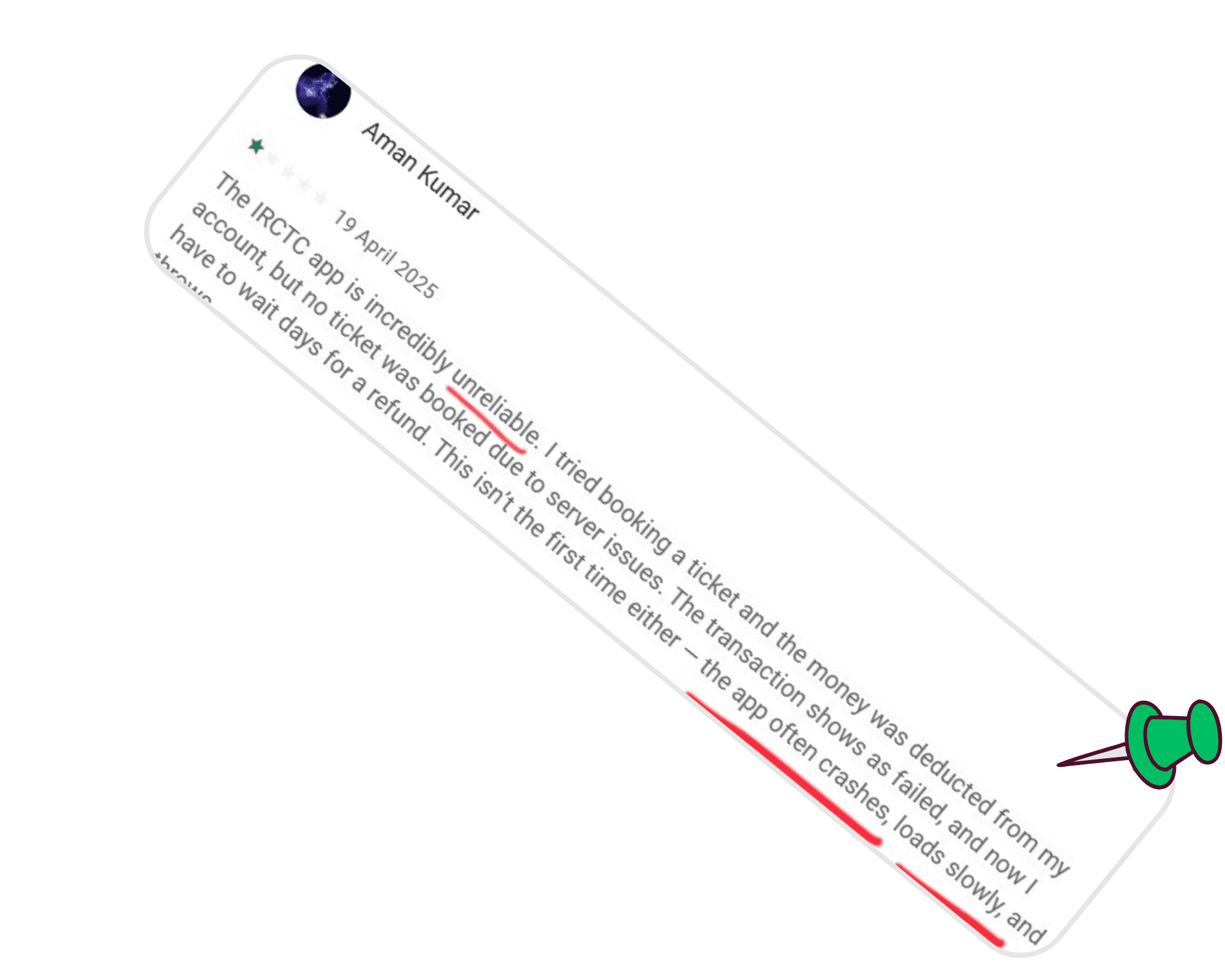
The current IRCTC mobile app, while widely used, suffers from serious usability issues that frustrate users and disrupt the booking experience.
Key pain points:
🔗 Redirection to external browsers for booking and payments, disrupting flow.
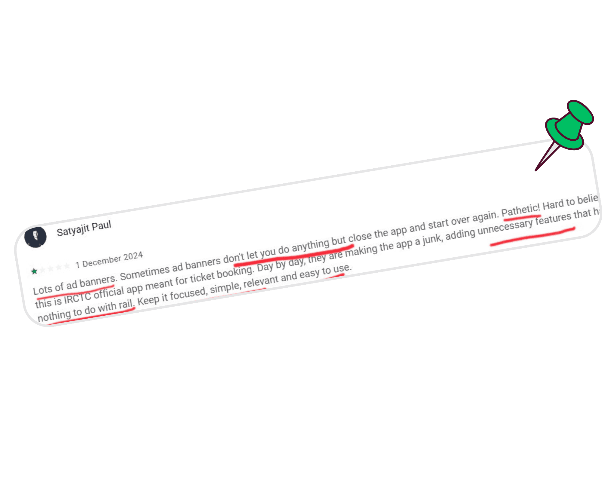
🧭 Cluttered layout with too many options presented at once.
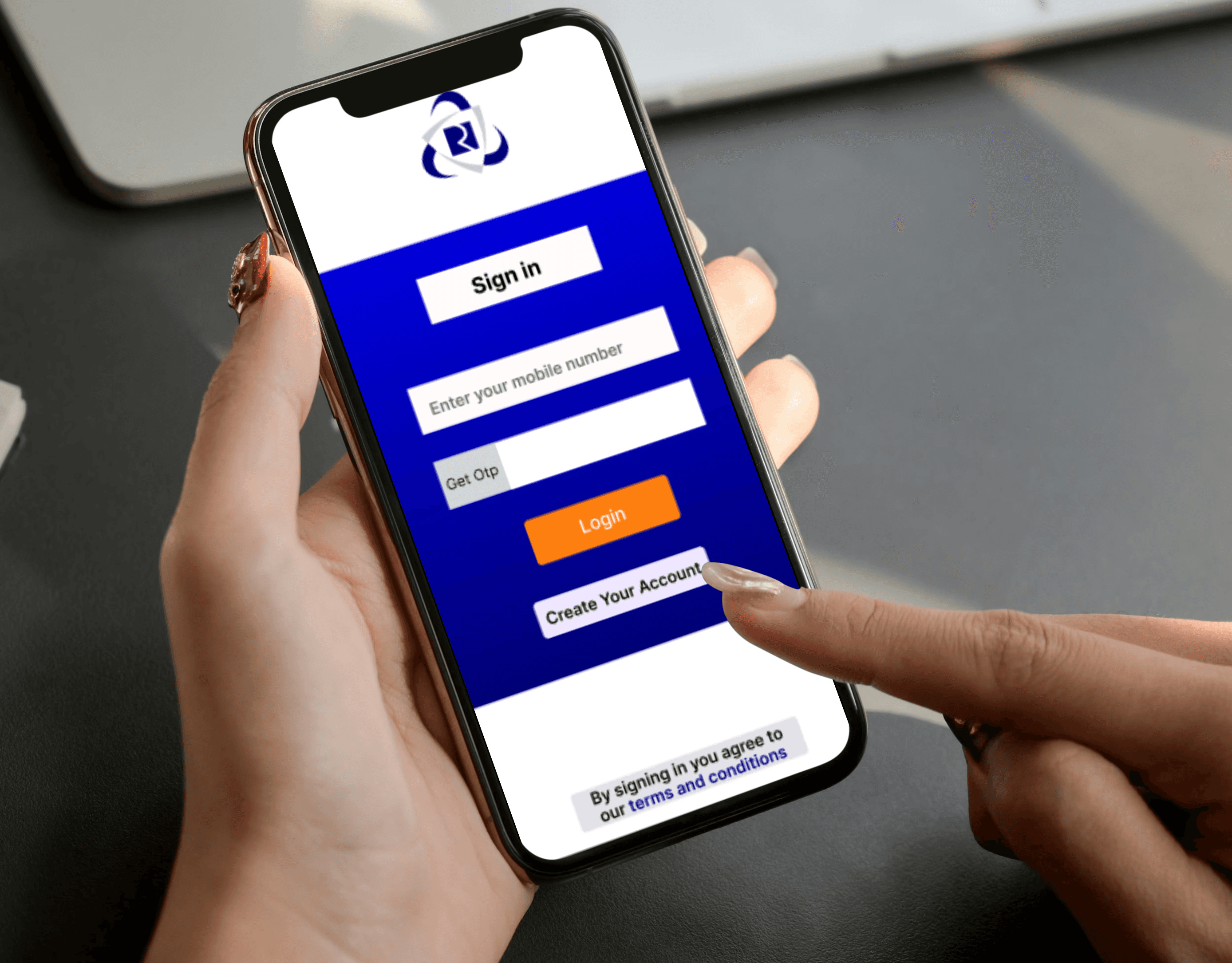
🎯 Unclear login experience – users often struggle to find the login button due to inconsistent placement and visual design.
🎨 Distracting color palette with excessive use of icons and bright elements.
📢 Promotional banners are mixed into the interface without distinction, leading to confusion.
Why a Redesign Was Needed⁉️: Real Feedback from IRCTC App Users
Goals
Simplify the end-to-end train booking journey
Design a responsive, mobile-first UI
Make the interface accessible to all age groups
Apply modern UX principles while preserving user familiarity
Solution
To address these issues, I redesigned the IRCTC mobile app with a focus on clarity, ease of use, and visual consistency.
Key improvements:
📱 Clean, user-friendly interface – simplified layout with clear visual hierarchy, making navigation easier and more predictable.
🔄 Merged Home + Rail Services – combined the homepage with core features like Book Ticket, PNR Status, File TDR to reduce clicks.
🧩 Prioritized layout – most-used services appear in the first row (Book Ticket, PNR, TDR), while secondary ones like Food, Flight, Bus are placed in the second row.
💡 Muscle memory–friendly design – consistent layout ensures users can quickly navigate the next time they open the app.
🔵 Color consistency – used only IRCTC’s brand blue and white, with orange CTAs for visual focus.
🚫 Decluttered visuals – removed noisy icons and distractions to support task completion.
🗂️ Dedicated ad space – promotional content is clearly separated and marked as ads.
🌐 In-app booking experience – eliminated browser redirects for a seamless, app-contained flow.
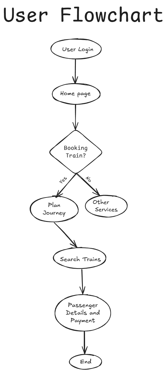
Old and New Login Page
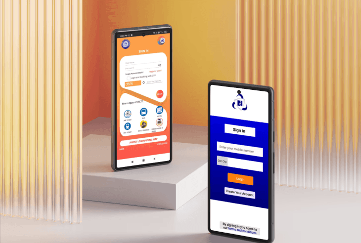
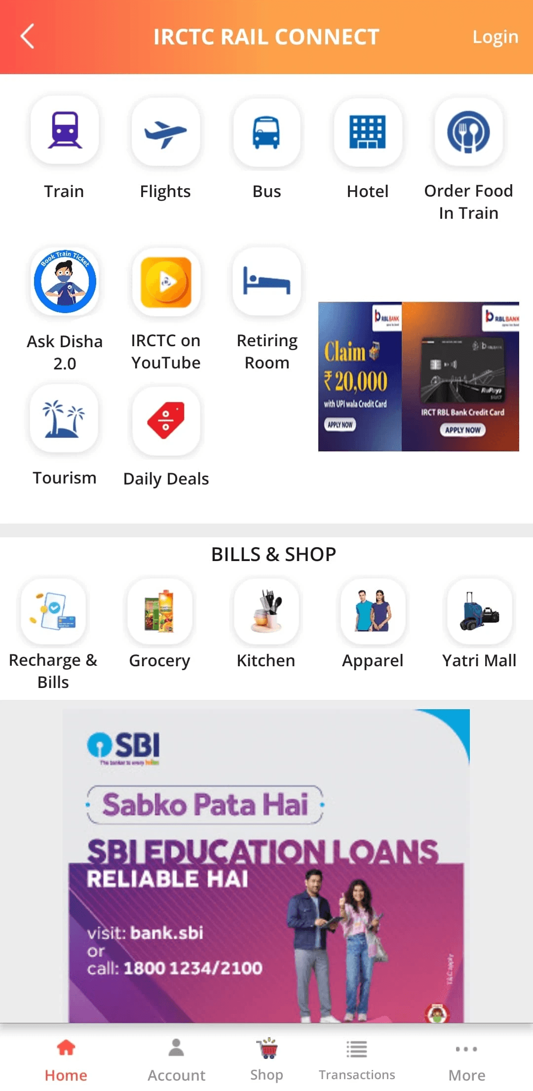
Old Home page + Train Services Page
New Home page + Train Services Page
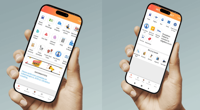
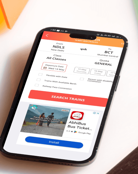
Plan Journey Page
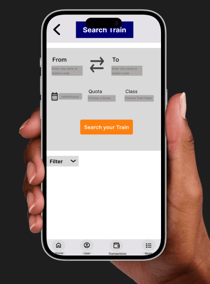
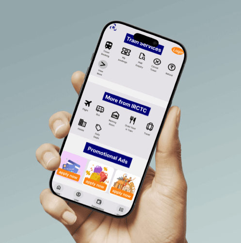
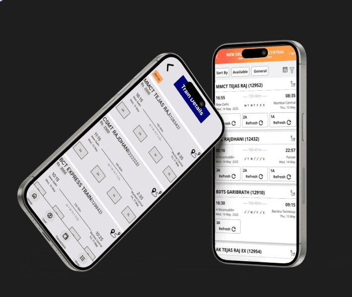
Search Train Page
🎨 Design Choices & Rationale
Brand-led palette – Stuck to IRCTC’s navy blue and white for the main UI to preserve familiarity and trust; used orange CTAs only to draw attention to primary actions (e.g. “Book Now”).
Minimal iconography – Removed decorative, multicolored icons so nothing competes with the booking flow; all icons are single-tone (blue/gray) to maintain focus.
Whitespace & hierarchy – Generous padding around elements and consistent font sizing (16px body, 24–32px headings) create clear visual hierarchy and reduce cognitive load.
Logical grouping – Merged Home + Rail Services screens; placed highest-priority tasks (Book Ticket, PNR, TDR) up top and secondary options below, so users instinctively know where to tap next.
In-app flow – Eliminated external redirects by keeping every step (login → search → payment) within the app, ensuring context and muscle-memory build over repeated use.
📈 Key Improvements at a Glance
Reduced clicks – Home to payment in 5 taps (instead of 8+).
Clear CTAs – Orange buttons stand out against a calm blue/white backdrop.
Dedicated ad zone – All promotions now live in one labeled section, never interrupting core tasks.
Simplified login – Consistent button placement and design mean users find “Login” immediately every time.
Task-first layout – Booking, PNR, and TDR always within thumb’s reach on the first row.
⚠️ Challenges Faced
Time constraints – Balancing thorough research and rapid prototyping within a tight deadline.
Brand restrictions – Adhering strictly to IRCTC’s color guidelines while still introducing fresh contrast for CTAs.
Legacy complexity – Untangling deeply nested flows (e.g. login redirects and browser hand-offs) without breaking existing backend integrations.
🎯 Conclusion & Takeaways
This redesign reinforced that simplicity trumps density: by stripping away non-essentials, users complete their core task—booking tickets—more quickly and confidently. The strict color scheme and logical grouping not only honor brand identity but also guide users’ eyes and taps unambiguously. Moving forward, this project has sharpened my skills in mobile-first UX, design systems, and data-driven decision-making—all essential for crafting high-impact products.
🛠️ Tools Used
Figma – Wireframes, high-fidelity UI, interactive prototype
Framer – Live portfolio page with embedded prototype
Notion – Research notes, case study write-up
Excalidraw – Sketch-style flowcharts and low-fi diagrams
Final Design(Prototype)
Click the expand arrow in the embed to open the full interactive prototype.
🤝 Let’s Connect
Thank you for exploring this case study.
If you’re interested in collaborating or hiring me, please reach out via email: ss2010saumya@gmail.com
[LinkedIn] | [Download Resume]